


Every housing debate — from a young professional agonising over a first flat in Manchester to a family weighing a Sydney unit against a Brisbane townhouse — eventually collides with a single, deceptively simple number: the price-to-rent ratio. It is the closest thing property markets have to a universal thermometer. And like any thermometer, it tells you something meaningful only if you know what temperature actually means for your situation.
The stakes are real. In an era of stubborn mortgage rates, thin rental supply and elevated home prices across Tier-1 markets — the United States, the United Kingdom, Canada, Australia and the United Arab Emirates — the wrong rent-vs-buy call is not measured in a couple of percentage points. It can be measured in tens or hundreds of thousands of dollars over a decade of holding costs, foregone capital growth, or opportunity cost on a down payment that was never invested elsewhere.
This guide has one job: to turn the price-to-rent ratio from a headline statistic into a working tool. By the end you will know how to compute the ratio, how to read it as a market-level signal, why it should never substitute for your own rent-vs-buy math, and how to combine it with related metrics like rental yield, cap rate and cash-on-cash return to reach a defensible personal decision. You will also see how to sanity-check every step using the free Price-to-Rent Ratio Calculator, the Rent-vs-Buy Calculatorand the Rental Yield Calculatoron LashkariProperties — a free property-tools platform built for exactly this kind of decision.
What you'll learn
How to compute the price-to-rent ratio for a city or a specific address, what thresholds like 15 and 20 actually mean, how the metric distorts in high-tax, high-appreciation, or rent-controlled Tier-1 markets, and a step-by-step framework that ends with a defensible personal rent-vs-buy decision.
Key Definitions and the Core Formula
The price-to-rent ratio (often abbreviated as P/R ratio) is a housing valuation ratio that compares the cost of ownership to the cost of renting the same or comparable property in the same market. It answers a question that headlines cannot: relative to what tenants are willing to pay to live in this area, how expensive is buying?
A few clarifications matter before you rely on this number:
- Home price is either the transaction price, the asking price, or a median price for equivalent homes in the same neighbourhood. Use the same convention across cities when comparing.
- Annual rent is monthly market rent multiplied by twelve. For a fairer investor lens, some analysts substitute net operating income — rent minus operating costs — which effectively converts the metric into the inverse of a cap rate.
- The ratio hasno units. A value of "18" means the property costs eighteen years of equivalent gross rent to purchase outright.
The three classic bands
Academic and industry work has converged on a rough interpretive scale, first popularised in the United States and later adapted globally. It is a heuristic, not a law:
Table 1 — Classic price-to-rent bands and what they typically imply
Rents are high relative to prices; ownership economics often work out.
Neither renting nor buying dominates; personal factors decide.
Yields are compressed; buying is usually justified only by capital-growth expectations or lifestyle.
Cash-flow investors typically walk away; owner-occupiers must depend heavily on appreciation.
Important caveat
These bands were originally calibrated in low-tax, medium-yield US markets. Applying them directly to central London or Sydney will tell you every home is "overvalued" — which is only useful if you also model long-term capital appreciation, foreign-buyer demand and rent control. Bands are starting points, not verdicts.
Where the metric originally came from
The price-to-rent ratio is not new — it is one of the oldest housing valuation tools in existence. Economists have used variants of it since the mid-twentieth century, treating housing as a durable asset that produces a stream of consumption value equivalent to rent. In its modern form, the ratio traces back to housing-affordability work published by U.S. research institutions and central banks throughout the 1990s and 2000s. The IMF, the Federal Reserve, the Bank of England and the Reserve Bank of Australia have all published price-to-rent series at various points, precisely because it is one of the few metrics that translates cleanly across borders. The 15/20 heuristic thresholds most commonly quoted today trace back to research popularised in the United States in the early 2000s and have been repeatedly re-tested since. They survived because they roughly separate cash-flow-positive from cash-flow-neutral rental scenarios under typical American financing conditions — not because they are magic numbers.
Why the reciprocal (yield) sometimes reads more intuitively
Some readers find it easier to think in yields than in multiples. A P/R ratio of 20 sounds abstract; a gross yield of 5% is instantly comparable to what a bond or a savings product might pay. The two are the same information, expressed differently. For quick mental math: divide 100 by the P/R ratio and you get the implied gross yield in percent. A P/R of 25 implies a 4% yield. A P/R of 10 implies a 10% yield. The reason we still lead with the ratio in this guide is that the multiple form ("the home costs 20 years of rent") reads faster for the rent-vs-buy question, while the yield form reads faster for the investor-return question. Fluency in both is worth building.
Related terms you should recognise
- Rental yield — the reciprocal of the P/R ratio, expressed as a percentage: annual rent divided by price. Seeour guide to cap rate for investors.
- Cap rate — net operating income divided by price. It is a "cleaner" investor version of the yield.
- Gross rent multiplier (GRM)— price divided by gross annual rent. Mathematically identical to P/R when both use gross rents; the label just varies by region.
- Cash-on-cash return — annual pre-tax cash flow divided by cash invested. Very different from P/R; captures leverage.
Why This Ratio Matters for Buyers, Investors and Landlords
A single valuation ratio cannot decide whether you should buy a home. But the price-to-rent ratio does two things almost no other metric can do:
- Itstrips out interest rates, personal tax situations, and financing structures, giving a clean comparison across cities and time periods.
- Itcompares the two real alternativesa housing consumer faces — buying vs renting — using the same underlying asset.
That combination makes it uniquely useful at three altitudes.
For owner-occupier buyers
A first-time buyer usually thinks in terms of monthly mortgage payments and a down payment they can just about scrape together. The P/R ratio pulls them out of that tunnel vision. If a city sits above 25, the buyer is implicitly betting that long-term capital appreciation will beat the difference between rent and total ownership costs — a bet worth making consciously, not by default. If a city sits below 15, the buyer is far more likely to be economically better off owning, even without much appreciation.
For investors
For rental investors the metric acts as a first-pass screen. High-ratio cities tend to reward capital-growth strategies (buy, hold, ride appreciation, refinance) while low-ratio cities tend to reward yield strategies (BRRRR, small multifamily, section 8 in the US, HMO in the UK). The ratio helps you match the market to the strategy instead of forcing a strategy that does not fit the market — a mismatch that quietly destroys returns for years before an investor notices.
For landlords weighing a sale
A landlord who bought at a P/R of 14 and now finds their local market at a P/R of 28 has, in effect, doubled the ratio without doubling the rent. That is the market telling them the exit price is disproportionately high relative to income. Whether to actually sell depends on tax position and reinvestment options, but the signal itself is loud and clear.
For renters trying to time the market
Renters are often the forgotten audience in rent-vs-buy analysis, yet they arguably have the most to gain from watching the ratio carefully. A renter in a city where the ratio has been climbing for a decade is, in one sense, on the right side of the trade — they are consuming housing at a discount relative to owners. But that same renter is exposed to rent-inflation risk, since ratios often normalize by rents catching up to prices rather than prices falling. Watching the ratio helps a renter time both a purchase entry and, importantly, negotiate rent renewals: in cities where the P/R ratio is compressing because rents are rising fast, tenants have less leverage; where it is compressing because prices are falling, tenants often have more.
For policymakers and city planners
Beyond individuals, the ratio is watched closely by policymakers. A sustained rise in P/R usually signals that ownership is becoming less accessible for median-income households — a leading indicator of political pressure for supply reform, taxation changes on second homes, or short-term-rental restrictions. Recent examples across Tier-1 markets include Australia's ongoing debate over negative gearing, Canada's foreign-buyer bans, and the UK's higher rate of stamp duty on additional dwellings. If you are buying in a market where the ratio has been stretched for years, expect policy to eventually push back — and factor policy risk into your holding-period assumptions.
"The price-to-rent ratio is not a verdict. It is a question the market is asking you — and demanding you answer with your own numbers."
How to Calculate the Price-to-Rent Ratio, Step by Step
The formula is simple; the discipline is in matching apples to apples. Here is the three-step process we use internally at LashkariProperties.
Step 1 — Anchor the price
For a specific property, use the current asking or agreed sale price. For a neighbourhood or city, use the median transaction price from a credible source such as the U.S.Census Bureau, the UK's HM Land Registry, Canada's CREA, the Australian Bureau of Statistics, or Dubai's DLD. Averages are noisier than medians in property; prefer medians.
Step 2 — Anchor the rent
Take the market rent for the same property or the closest available comparables — same bed count, same postcode, similar condition. Multiply by twelve. Do not deduct anything at this stage: the classic ratio uses gross rent.
Step 3 — Divide and interpret
Divide price by annual rent. Compare the result to the bands in Table 1, then immediately note any local nuance that might distort the reading. Central London and Sydney will always look overvalued through a raw P/R lens; Cleveland and parts of Detroit will always look cheap. The next section shows why.
Best practice
Whenever possible, calculate the ratio at two altitudes: the city-wide median (for market context) and the street-level comparable (for your specific property). A gap of more than 20% between the two is a signal that the individual deal is meaningfully mispriced relative to the local baseline — either an opportunity or a warning depending on direction.
Data sources you can actually trust
The biggest source of P/R errors is not arithmetic — it is bad data. For price inputs, prefer official transaction registries over listing portals: listing prices are asking prices, and asking is not the same as closing. In the US, that means county recorder data or a repeat-sales index. In the UK, the HM Land Registry Price Paid data is the gold standard. In Canada, provincial land title systems and CREA aggregates are the go-to. Australia has state-level Valuer-General data plus CoreLogic and PropTrack indices. In the UAE, the Dubai Land Department and Abu Dhabi's DMT publish transaction data at high resolution.
For rent inputs the challenge is subtler because rental transactions are rarely centrally registered. Portals like Zillow, Rightmove, Realtor.ca, Domain and Property Finder are useful but list asking rents, which tend to be 3–8% above achieved rents in soft markets and roughly matched in tight ones. Whenever possible, cross-check with a private landlord who has recently signed a lease on the same block, or with a letting agent who manages nearby stock. Small errors in rent estimation compound: a 5% overstatement in monthly rent understates the P/R ratio by roughly 5%, which can move a property from one interpretive band to another.
What time frame to use
For a market-level P/R, use the most recent full quarter's median transaction price and current asking rents. Do not mix a two-year-old median price with today's rent — you will systematically bias the ratio downward in appreciating markets and upward in falling ones. For a property-level calculation, use today's asking or offer price and the current market rent for comparable units. Where you have access to a repeat-sales index, applying a small adjustment to bring older transaction data forward to "today" is legitimate; guessing is not.
Worked Examples: Three Very Different Markets
Formulas make more sense with numbers. Below are three fully-worked scenarios covering different Tier-1 markets and different buyer profiles. All figures are illustrative and rounded; verify before making a real decision.
Example 1 — Owner-occupier in Manchester, UK
Sarah is looking at a two-bedroom flat in Salford, Greater Manchester, listed at £285,000. Comparable flats in the same building rent for £1,350 per month.
- Annual rent = £1,350 × 12 = £16,200
- Price-to-rent ratio = £285,000 ÷ £16,200 = 17.6
- Implied gross yield ≈5.7%
Manchester as a whole trades in the high-teens, so this flat sits close to the market median. It falls in the balanced band. For Sarah — who plans to stay at least seven years, has a stable job, and can put down 15% — the ratio is not a red flag. Whether she buys depends less on the market signal and more on whether the total monthly cost of owning (mortgage, service charge, ground rent, insurance, maintenance, opportunity cost) leaves her better off than renting the same flat and investing the difference.
Example 2 — Yield-focused investor in Houston, USA
Raj wants a single-family rental in Katy, a Houston suburb. Comparable homes list around $325,000 and rent for $2,150 a month.
- Annual rent = $2,150 × 12 = $25,800
- Price-to-rent ratio = $325,000 ÷ $25,800 = 12.6
- Implied gross yield ≈7.9%
A ratio in the low-teens firmly favours ownership on paper — this is exactly the kind of market where yield strategies can work. But before Raj commits, he must layer in Texas property taxes (often 2%+ of assessed value), insurance (elevated by hurricane and wind risk), and HOA fees. Once those are subtracted, the net yield can drop by 200–300 basis points. Ourcash-on-cash return guide covers exactly this next step.
Example 3 — Sydney family weighing rent vs buy
Emma and Tom are renting a three-bedroom house in Sydney's Inner West for A$2,050 per week. Buying an equivalent house would cost around A$2,850,000.
- Annual rent = A$2,050 × 52 =A$24,600
- Price-to-rent ratio = A$2,850,000 ÷ A$24,600 = 33.9
- Implied gross yield ≈2.95%
A ratio of 34 is squarely in the strongly renting-favored zone. On paper, Emma and Tom are getting a bargain by continuing to rent. But that ignores three uniquely Australian dynamics: no perpetual security of tenure for renters, negative-gearing tax treatment for landlords, and a long track record of central-city capital growth outpacing rental growth. This is precisely the situation where the ratio must be paired with a proper rent-vs-buy calculation before drawing a conclusion.
Example 4 — Dubai investor comparing two neighbourhoods
Aisha is comparing two one-bedroom apartments as buy-to-let investments: one in Jumeirah Village Circle (JVC) at AED 850,000 renting for AED 65,000 per year, and one in Downtown Dubai at AED 1,850,000 renting for AED 110,000 per year.
- JVC: P/R = 850,000 ÷ 65,000 = 13.1, gross yield ≈7.6%
- Downtown: P/R = 1,850,000 ÷ 110,000 = 16.8, gross yield ≈5.9%
Both properties look attractive on a global scale, but JVC screens as the stronger cash-flow investment while Downtown carries a lifestyle and prestige premium that shows up as a higher ratio. The right choice depends on Aisha's strategy: if she wants yield and is comfortable with newer suburban stock, JVC wins on the ratio. If she wants capital growth exposure and a more liquid resale market, the premium at Downtown may be justified. This is a classic case of the ratio acting as a filter, not a verdict.
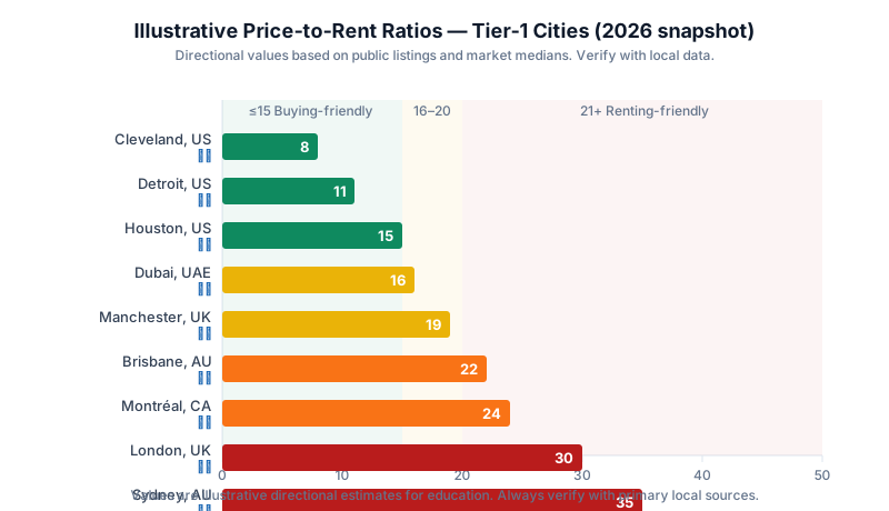
Tier-1 Market Nuances: Why the Same Ratio Means Different Things
The mistake most people make with the P/R ratio is treating a value like "22" as globally meaningful. In practice, structural differences between countries change what that value implies. Below is a country-by-country lens for the five markets LashkariProperties users search most.
The US has one of the widest intra-country P/R spreads on earth. Coastal metros — San Francisco, New York, Los Angeles, Seattle — commonly clear 25 and can push past 40 in specific ZIP codes. Meanwhile, Rust Belt and Sun Belt secondary markets like Cleveland, Memphis, Birmingham (AL) or parts of Indianapolis often trade below 12. Property tax is a bigger swing factor than most buyers realise: 30-year fixed rate mortgages are the norm and mortgage interest is partly deductible for many owner-occupiers, which shifts the personal calculation but not the raw ratio.
London, and especially prime central London, has always traded at elevated P/R ratios — often above 30 — reflecting foreign capital, safe-haven demand and constrained supply. Regional cities (Manchester, Leeds, Birmingham, Glasgow, Sheffield) sit meaningfully lower, typically 15 to 20. Two UK-specific factors matter: leasehold vs freehold structure (which affects true ownership cost), and stamp duty (which effectively front-loads the transaction cost of switching from rent to own). See the UK government's SDLT guidance for the current thresholds.
Canada
Toronto and Vancouver routinely post P/R ratios above 30, driven partly by immigration-led housing demand and constrained land supply. Alberta and Prairies cities are noticeably lower. Canada's mortgage market operates on shorter fixed-rate terms (5-year is standard) that reset — a structural risk that no single ratio captures. Rental rules vary sharply by province.
Australia
Sydney and Melbourne consistently rank among the world's highest-P/R major cities. Brisbane, Adelaide and Perth are lower but have climbed sharply post-2020. Australia's tax system (negative gearing, capital gains discount for holdings over 12 months) means investor demand supports higher ratios than would otherwise be sustainable. Local research bodies such as the Reserve Bank of Australiapublish regular housing affordability analyses worth reading alongside any P/R calculation.
Dubai is unusual for a global city: it typically shows P/R ratios in the mid-teens because rental demand from expatriates keeps yields high while purchase prices are anchored by an abundant new-build pipeline. Abu Dhabi behaves similarly. Two nuances matter: rents in UAE are often paid annually or quarterly (front-loaded cash flow), and there is no personal income tax, which changes the after-tax rent-vs-buy calculus entirely versus, say, the UK or Canada.
Table 2 — Structural factors that distort raw P/R comparisons between Tier-1 markets
High property tax, cheap financing, deep MLS transparency
Constrained supply, foreign capital, high land value
Global reserve-asset status, foreign buyers
5-year fixed-rate resets, immigration demand
Negative gearing, CGT discount, tight land release
Rising interstate migration, resource cycles
Expat rental demand, no income tax, new-build pipeline
Do not compare across countries without adjustments
A P/R of 22 in Sydney implies something structurally different from a P/R of 22 in Manchester or Dubai. Country-level tax treatment, financing structure, and appreciation regimes all matter. Always benchmark against a city's own historical range, not a foreign market's.
How interest rates warp interpretation
The classic 15/20 bands were popularised in an era of 6–7% US 30-year mortgage rates. Between 2020 and 2022, rates fell to sub-3% and buyers could support far higher prices — pushing P/R ratios up across every major market. Then the sharp normalization in 2023–2025 raised financing costs faster than either prices or rents adjusted, leaving many Tier-1 cities with ratios that look historically high yet, on a monthly cost basis, are less affordable than they were at lower ratios five years earlier. Two lessons follow. First, the ratio should always be interpreted alongside the prevailing mortgage rate; a P/R of 22 at 3% is a very different animal from a P/R of 22 at 7%. Second, rate-driven distortions tend to unwind over years, not months — so the ratio's usefulness is stronger over multi-year windows than for near-term timing.
Rent control and tenancy law
Not all rents are free-market rents. New York, San Francisco, Berlin, parts of the Netherlands and, more recently, Scotland and several Canadian provinces have introduced varying degrees of rent caps or indexation. Where controls exist, the ratio can be structurally elevated because rents are legally prevented from rising to their free-market level, while prices continue to reflect potential future rental streams. If you are calculating a ratio in a rent-controlled sub-market, always ask whether the rent in the numerator is contract rent, market rent, or a mix — the difference can be 20–40% and will completely change how you read the ratio.
Currency, foreign capital and reserve-asset effects
In some Tier-1 markets, particularly London, Vancouver, Sydney and Dubai, a meaningful share of transaction volume comes from foreign buyers using property as a store of value rather than a yield asset. This effectively raises the price floor without lifting rents, structurally pushing the ratio up. That does not automatically mean the market is a bubble — foreign demand can persist for decades — but it does mean the ratio in these cities is telling you more about capital flows than about local rental economics. Always ask what share of transactions in your target neighbourhood are non-resident purchases before trusting the ratio at face value.
Common Mistakes and Persistent Myths
Because the price-to-rent ratio is so easy to compute, it is also easy to misuse. These are the traps that come up most often when buyers first run the ratio on their own numbers.
Mistake 1 — Comparing rent apples to price oranges
The single most common error is calculating price using one property (say, a specific three-bed you're viewing) and rent using an unrelated median (say, "average rent in this suburb"). If the specific property is above average and the rent is at the median, the ratio is artificially inflated. Always compare like with like.
Mistake 2 — Treating thresholds as universal truths
The 15/20 bands come from a specific American context. Ignoring appreciation, tax and rent-control regimes is like judging a car's fuel economy without asking whether it's driven mostly in city traffic or highway cruising.
Mistake 3 — Ignoring the denominator's growth
A high P/R ratio compresses fast when rents grow faster than prices — as they did across much of the US Sun Belt and UK regional cities in 2022–2024. Static ratios miss dynamic re-ratings.
Mistake 4 — Forgetting transaction costs
Buying a home involves 3–8% in transaction friction (stamp duty, legal fees, agent commissions, mortgage arrangement, mover costs). A ratio-based case for buying that ignores these frictions is not actually a case for buying — it's a case for owning the asset costlessly, which no one gets to do.
Mistake 5 — Confusing gross with net
If you use net rent (after operating costs) in the numerator's counterpart, you're calculating a version of the inverse of cap rate — not the classic P/R ratio. Both are legitimate metrics, but mixing conventions leads to non-comparable numbers.
Myth — "If the ratio is high, house prices must fall"
Not necessarily. Ratios can normalize through rising rents just as easily as through falling prices, and structural factors (supply constraints, immigration, tax treatment) can hold ratios elevated for a decade or more. Betting on a mean-reversion crash based on P/R alone has a poor track record.
Myth — "The ratio matters most for investors"
Actually, it matters just as much for owner-occupiers. An owner-occupier at a P/R of 30 is silently making the same appreciation bet that a rental investor makes at a cap rate of 3.3% — they just call it "buying a home" instead of "buying an investment."
Myth — "Rents always keep up with inflation, so buying always wins long-term"
Rents do tend to track inflation over very long windows, but the path matters. In cities with heavy new-build supply (parts of Texas, Perth in the 2015–2019 cycle, Dubai post-2023 handovers) rents have flattened or fallen for extended periods even as inflation ran high. If your rent-vs-buy math assumes rents will rise every year at CPI, stress-test what happens if they stagnate for three to five years. The break-even year usually shifts materially.
Myth — "A ratio calculated once is good for the whole holding period"
The ratio is a snapshot. Prices and rents move at different speeds and often in different directions within the same cycle. A prudent analyst re-runs the ratio at least annually, and treats sharp changes as prompts to reconsider strategy — not as instructions to trade in and out of ownership.
Mistake 6 — Anchoring on a nominal price rather than a real one
If inflation is running at 4% and home prices are rising 3%, the ratio using nominal numbers can look flat while real (inflation-adjusted) prices are falling. For long-horizon decisions, especially across a full cycle, running the ratio in real terms alongside nominal is worthwhile. It rarely changes the immediate decision, but it changes the story you tell yourself about the decision — and stories drive behaviour.
Not personal advice
This article is educational content, not personalised financial, tax or legal advice. Tax rules, lending eligibility and legal processes differ by country and by state or province. Before acting on any of the calculations here, verify the numbers with a licensed local professional.
How the Price-to-Rent Ratio Connects to Other Property Metrics
Ratios exist in a family. Understanding how the P/R ratio relates to its cousins is what separates a rough screener from a real analysis.
Rental yield (gross and net)
Rental yield is the inverse of the P/R ratio expressed as a percentage. A P/R of 20 equals a 5% gross yield. Net rental yield subtracts operating costs before dividing — a much better lens for landlords. You can convert quickly with the free Rental Yield Calculator.
Cap rate
Cap rate is net operating income divided by property price. It is what the P/R ratio becomes when you strip out gross-rent noise and financing. For pure investment analysis, cap rate is usually more useful than the raw P/R ratio — see our full Cap Rate Explainedguide, and Cap Rate vs Cash Flowfor the trade-off.
Cash-on-cash return
Cash-on-cash return measures actual pre-tax cash flow divided by cash invested. It is deeply affected by leverage, which the P/R ratio ignores entirely. Two properties with identical P/R ratios can have wildly different cash-on-cash returns depending on down payment and interest rate. Ourcash-on-cash return guide walks through the exact calculation.
Debt Service Coverage Ratio (DSCR)
DSCR is net operating income divided by debt service. It is a lender's metric, but it also tells an investor whether a deal survives without personal top-ups. See our DSCR guide for investors.
How the ratios stack in a decision workflow
- Start with P/R ratio to filter markets.
- Move to gross yield to shortlist neighbourhoods.
- Usecap rate to shortlist individual properties.
- Layer in cash-on-cash return and DSCRto size the actual deal.
- Finish with apersonal rent-vs-buy calculation for owner-occupiers, or aten-year cash-flow projection for investors.
How to Run the Numbers with Free LashkariProperties Calculators
Everything above becomes far more concrete once you feed it into real inputs. LashkariProperties builds free property-tools designed to work together, so the output of one calculator flows into the next. For this article, three tools cover 95% of what most readers need.
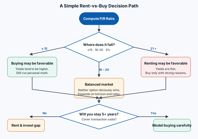
Step 1 — Get the market signal
Open the Price-to-Rent Ratio Calculator. Enter the property price and the monthly market rent for the same property. The calculator returns the ratio and places it on the interpretive band. This is your market-level signal.
Step 2 — Convert to a yield lens
Switch to the Rental Yield Calculatorto see both gross and net yield. Net yield tells you whether the property still looks attractive after realistic operating costs — the number lenders and serious investors care about.
Step 3 — Answer the personal rent-vs-buy question
This is where most articles stop and where LashkariProperties users go deeper. Open the Rent-vs-Buy Calculatorand enter:
- Home price and current rent for a comparable home
- Down payment and mortgage rate
- Planned holding period (years you'll actually stay)
- Expected rent growth, home appreciation and investment return on the freed-up cash
- Ownership costs: property tax, insurance, maintenance %, HOA/strata
The calculator produces a break-even year and a net-worth comparison after your holding period. That is the number that ultimately matters — far more than any static ratio.
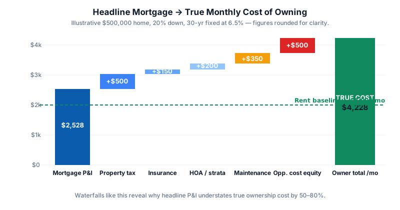
Run your numbers in under 10 minutes
Cross-check any market or property with the exact three-tool workflow used in this guide.
Calculator outputs are educational estimates only. Tax treatment, mortgage eligibility and legal costs vary by country and jurisdiction — please verify with a licensed professional before making any purchase, sale or investment decision.
Actionable Framework and Checklist
Bring everything together into a repeatable framework you can apply to any city or any property. This is the exact sequence we recommend inside LashkariProperties' investor programmes.
The 6-question framework
- What is the city-wide P/R ratio right now?Compare to its own 10-year history and to peer cities.
- What is the property-level P/R ratio?Measure the gap vs city median.
- What is the implied gross and net yield?Use the Rental Yield Calculator.
- What are the true monthly ownership costs?Include tax, insurance, maintenance, opportunity cost.
- What is the personal rent-vs-buy break-even year?Use the Rent-vs-Buy Calculator.
- What can go wrong?Stress-test rate, rent-growth and holding-period assumptions.
Pre-decision checklist
- Calculated both the city and property-level price-to-rent ratios.
- Placed the ratio in the city's own historical range, not just the global band.
- Converted to both gross and net rental yield.
- Modelled all real ownership costs — including opportunity cost on the down payment.
- Chosen a realistic holding period (not "forever" as a placeholder).
- Compared owning to renting-plus-investing the difference at a defensible return.
- Stress-tested for a rate rise of at least 200 basis points.
- Confirmed transaction costs are included on both sides of the ledger.
- Read local tax rules (or spoken to a qualified professional).
- Verified all numbers with the LashkariProperties calculators.
As a broad rule of thumb, a price-to-rent ratio of 15 or below suggests buying is relatively affordable, 16 to 20 is a balanced market, and 21 or above signals renting is often cheaper than owning. These are heuristics, not universal rules — always validate with a personal rent-vs-buy calculation.
How do you calculate the price-to-rent ratio?
Divide the property price by the expected annual rent for the same property. A home priced at $450,000 that would rent for $2,000 a month ($24,000 a year) has a price-to-rent ratio of 18.75.
Not automatically. A high ratio typically means rental yields are compressed, so cash-flow investors will find fewer opportunities. Long-term owner-occupiers who value stability and expect capital growth may still find buying rational at higher ratios.
How is the price-to-rent ratio different from rental yield?
They are mathematical inverses. Rental yield is annual rent divided by price and is expressed as a percentage. Price-to-rent ratio is price divided by annual rent and is a plain number. A 5% gross yield equals a P/R ratio of 20.
Does the price-to-rent ratio work for individual properties?
Yes, but its greatest value is as a market-level signal. For a specific property, layer in cap rate, cash-on-cash return, and a full rent-vs-buy calculation that accounts for taxes, maintenance and opportunity cost.
What price-to-rent ratio do global cities like London, New York and Sydney typically have?
Gateway cities such as London, New York, Sydney and Vancouver consistently trade at ratios above 25 and sometimes above 35. Secondary US cities like Cleveland, Detroit or parts of the Midwest often sit in the 8–15 range.
Should I use gross or net rent in the calculation?
The classic definition uses gross annual rent. For a sharper investor lens, some analysts substitute net operating income — which converts the metric into the inverse of a cap rate.
How often should I recheck a city's price-to-rent ratio?
Once or twice a year is usually enough for long-term decisions. Interest-rate shocks, rental-control changes or major supply announcements are good triggers to recalculate sooner.
Can the price-to-rent ratio predict a housing crash?
No single metric can predict a crash. Elevated ratios have historically coincided with overvalued markets, but timing corrections is unreliable. Treat the ratio as one input in a broader dashboard covering affordability, credit availability and supply.
How does the price-to-rent ratio differ across Tier-1 markets?
It varies widely. UAE hubs like Dubai often sit in the mid-teens due to strong rental demand. UK secondary cities like Manchester tend to be in the high teens. Sydney, Vancouver and central London routinely exceed 30. US Sun Belt and Midwest markets can be as low as 8–12.
Is renting always cheaper when the ratio is above 20?
On a monthly cash basis, usually yes. But renting means forgoing potential capital growth and the forced savings from mortgage principal. Whether renting is truly cheaper depends on your holding period, expected appreciation, and how you invest the freed-up cash.
What tools can I use to check the numbers?
Use LashkariProperties' free Price-to-Rent Ratio Calculator,Rent-vs-Buy Calculator, and Rental Yield Calculatorto compare markets and stress-test your personal decision.
Stress-Testing Your P/R-Based Decision
Every P/R-informed decision rests on a small number of assumptions that, if wrong, can flip the result. Serious buyers and investors do not simply run one scenario — they run at least three and ask whether the decision holds up in the worst reasonable case.
The three scenarios you should always run
- Base case. Best-estimate assumptions for prices, rents, rates and holding period.
- Downside case. Prices flat or falling 10%, rents flat, mortgage rate up 200 basis points, holding period shortened by two years due to a life change.
- Rate-shock case. Base-case fundamentals, but you have to refinance at 200bp higher than today. In Canada and much of Europe, this is a live risk on every renewal.
If the decision to buy is robust across all three, you can proceed with confidence. If the buy case only wins in the base case, the decision is fragile and probably needs revisiting. Renting is often a decision to preserve optionality — and optionality has real value in uncertain rate and job environments.
What a well-stress-tested worksheet looks like
Table 3 — Sample stress-test grid for a Manchester owner-occupier at a P/R of 17.6
This kind of grid takes ten minutes with the Rent-vs-Buy Calculatorand prevents the majority of "I wish I had known" regrets that appear three or four years after a purchase.
Behavioural traps to watch for
Even a well-built model can lead to a bad decision if the human running it is anchored on the wrong number. Three biases show up repeatedly:
- Anchoring on peak prices.A ratio that looks "cheap" relative to two years ago may still be expensive relative to the ten-year average. The reference point matters.
- Overweighting rare stories.A friend who bought a Sydney house in 2005 and made a fortune is a survivorship-biased data point. The city-level ratio history is a better guide than any single anecdote.
- Confusing certainty with familiarity.A market you know feels less risky than one you don't, but familiarity is not the same as safety. Ratios help you compare unfamiliar markets to familiar ones on a level playing field.
The Landlord's Lens: Using the Ratio to Time Buys, Sells and Refinances
Owner-occupiers care about the ratio at the moment of a rent-vs-buy decision. Landlords should care about it continuously, because the ratio is one of the cleanest signals available for portfolio rebalancing.
When the ratio is expanding faster than rents
If prices in your target city are rising 8% a year while rents are rising 3%, the ratio is expanding. On paper this makes your existing portfolio more valuable, but it also compresses the yield on new acquisitions. Historically, sustained ratio expansion at this pace has ended in either a rent catch-up (as in parts of the US Sun Belt post-2022), a price stall (as in London 2016–2019), or a correction. In none of these paths is aggressive buying at the top of the expansion rewarded. Landlords should tilt toward selling their weakest-yielding assets or refinancing to release equity, not toward buying more of the same city.
When the ratio is contracting because rents are rising
This is the friendliest environment for existing landlords. The value of the asset base is protected while cash flow improves. It is also often the best time to add supply, provided you can lock in financing before rate expectations reprice.
When the ratio is contracting because prices are falling
Harder to read. Rents may be sticky downward, but tenant demand often softens too as the local economy weakens. This is the environment where cash-on-cash return and DSCR — not P/R — should dominate decision-making. See the DSCR guide for a full treatment.
Portfolio rebalancing rule of thumb
A useful heuristic used by disciplined investors: when a city's P/R ratio moves more than 30% above its 10-year median, review every holding in that market for a possible sale, especially the ones with weakest incremental cash-on-cash returns. When it moves more than 20% below the median, review whether you are underweight the market and can add responsibly. These are triggers to review, not automatic actions.
Conclusion & Next Steps
The price-to-rent ratio is the single most useful entry-point metric in residential property. It is easy to compute, easy to compare across markets, and — used correctly — points a bright light on the question every housing consumer must eventually answer: am I paying a fair price for the right to own this asset instead of renting it?
Used incorrectly, it becomes a false verdict. Bands calibrated for one country get imported into another. Gross rent gets mixed with net operating income. Transaction costs get quietly ignored. And the personal rent-vs-buy calculation — the only calculation that ultimately settles the question for you — never gets run.
The framework in this guide fixes that. Start with the market signal. Move into your personal inputs. Stress-test with the calculators. Arrive at a defensible decision that survives contact with reality when interest rates, rents or your own life plans change.
Continue with the numbers-first path
Explore related guides and pair them with the calculator that fits your situation.
Sources
Related reading
Continue reading: Break-Even Occupancy for Landlords · How to Calculate Rental Yield (2026) · Cap Rate Explained for Investors. Run your own numbers with the Price-to-Rent Ratio Calculator — it takes under a minute and beats guessing.
Related reading
- Rent vs Buy: A Numbers-First Decision Framework
- Cap Rate Explained for Property Investors
- Cap Rate vs Cash Flow: Which Metric Should Guide Your Decision?
- Cash-on-Cash Return: How to Calculate It Properly
- DSCR Explained: The Investor Loan Metric That Matters
Frequently asked questions
What is the price-to-rent ratio?
It is the property price divided by a year's rent. A ratio of 20 means the price equals 20 years of rent. Higher ratios signal markets where prices have run ahead of rents; lower ratios signal income-friendly markets.
What is a good price-to-rent ratio?
Rules of thumb vary, with ratios around 15 to 20 often discussed as a dividing line, but the honest answer depends on your market's tax, appreciation, and rent-control rules. Use it as a market signal, never as a standalone valuation.
How do I use the ratio in a rent-versus-buy decision?
Compare your rent against the full cost of ownership, including the opportunity cost of your deposit and sale costs. A high ratio generally lengthens the years you must stay before buying wins, which is exactly what the Rent vs Buy Calculator shows.
What is the price-to-rent ratio in major cities right now?
Typical ratios in 2026 sit between 15 and 25 in most Western cities: around 18 to 22 across US metros, 20 to 25 in London, and 15 to 20 in Australian capitals. Ratios above 25 signal renting may be financially smarter than buying; below 15, buying is usually the better long-term move. The ratio is a market thermometer, not a personal verdict — your individual time horizon and plans still matter more than the city average.